Designer creates visual information that communicates across languages
By Byron Rempel-Burkholder
 Harrisburg, Pennsylvania, USA – It’s easy for anyone to get lost in the Harrisburg Farm Show Complex, especially if you can’t read the English signs above the entrances to the vast halls that are typically used for livestock shows and auctions.
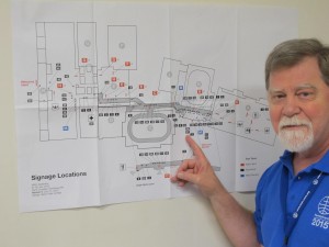
That was the challenge designer Glenn Fretz faced this year as Mennonite World Conference Assembly 16 in Harrisburg, Pa., neared. In addition to designing the printed materials, welcome flags, stage banners for the gathering, he had to create a unique map of the complex with labels more fitting to an international church conference than a country fair. He had to plan where the signs and arrows would be placed so that traffic could flow smoothly. And, of course, the colour scheme of the map would reflect the six colours that the MWC community has come to know and love.
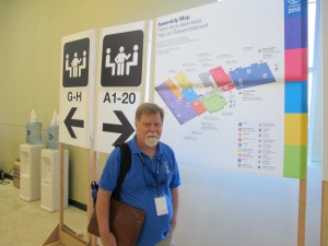
 Fretz gave each location a single letter instead of a word, placed on a colourful dot: A for the Exhibition Hall, for example, and C for the Large Arena.
Fretz, who developed MWC’s logo in the 1970s, was no stranger to the task. For the 1978 Assembly in Wichita, he developed a system of non-verbal signs, based on pictographs used in airports – for food, elevators, restrooms and the like.
“Non-English speakers are used to using visual imagery,” Fretz says.
Fretz also coordinated the logistics of printing and erecting the signs from finding a printer to construction of the stands.
Fretz is especially grateful for the support of a printer, Clair Lehman with Mennonite roots in Lancaster County. “DavCo showed particular interest in meeting our needs and went beyond the call of duty to make sure we got what we needed in time.”
Byron Rempel-Burkholder is a freelance writer and editor from Winnipeg.
Photos show Glenn Fretz of Waterloo, Ontario, with the initial planning map and some of the hallway signage.
